


See credits burn before renewal
Credits, data transfer, and AI usage plot across the billing cycle on the WEXTL dashboard — the same chart ops and billing open after a busy week of runs.
- GDPR
- Data Encryption
- 2FA
- Local Data Region
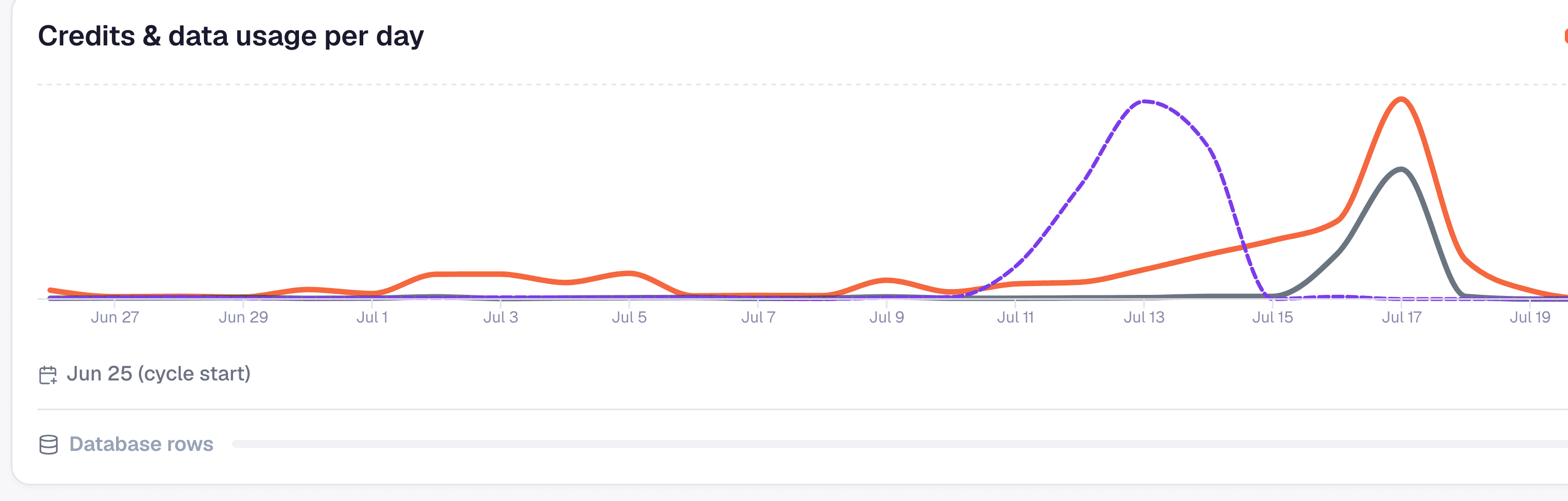
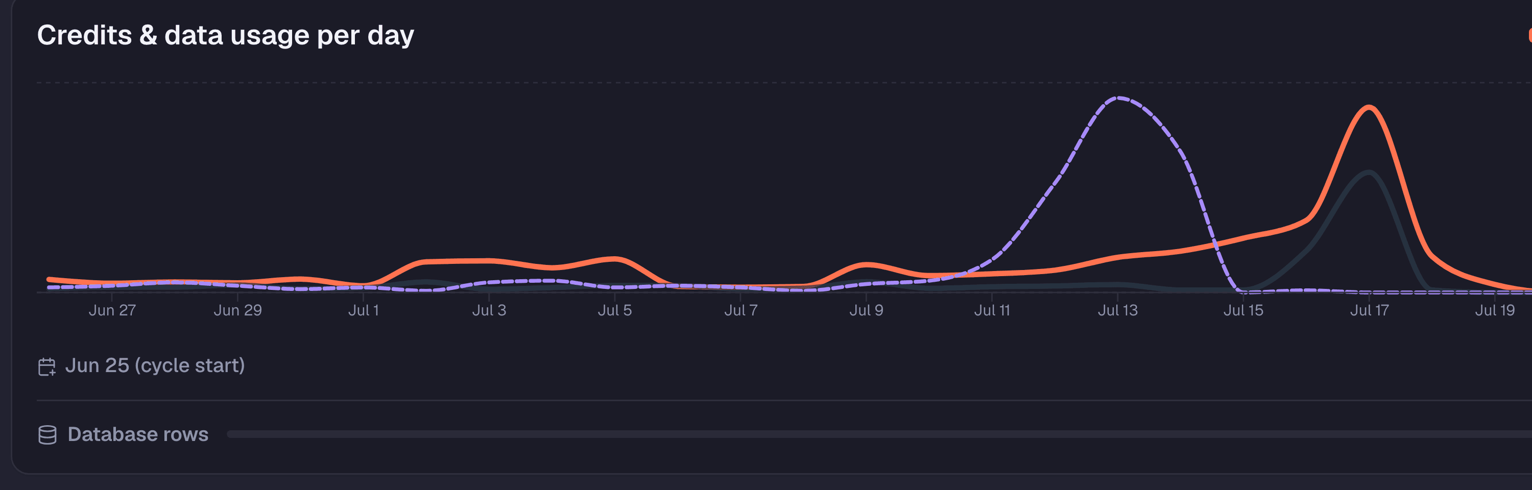
Credits and data usage chart on the WEXTL dashboard
What Analytics helps you do
Usage you can actually read
- 1
Every run debits three counters
Workflow steps debit plan credits, AI nodes debit AI credits, and payload size debits data transfer in MB — the same three counters the chart plots below.
- 2
The dashboard plots per day, not per month
Credits, data MB, and AI credits break out day by day across the current billing window, so what you read is a trend line, not one opaque monthly total.
- 3
Stat strip flags the pace before reset
Credits left, average per day, and the reset date sit above the chart — enough to tell whether the current burn rate clears the cycle or runs out before renewal.
Hover a day, compare all three series
Credits, data transfer, and AI credits plot as three separate lines on one chart — not three reports you cross-reference by hand.
Hover any day to read the exact numbers for that day across all three — for example (illustrative): 40 workflow credits, 12 MB transferred, 8 AI credits. Useful the moment one series moves and you need to know whether the other two did too.
An AI Agent node that retries on every webhook delivery shows up as an AI-credit spike on a specific day, visually distinct from a data-transfer spike caused by a large file step landing the same week — the chart tells the two apart instead of blending them into one “usage” number.
The chart aggregates credits, data, and AI usage across every workflow in the org for the current cycle. It tells you a spike happened on a given day — it does not tell you which workflow caused it.
Pair it with each workflow's own Runs tab: per-execution credit chips there let you match a spike day to the specific workflow and run that spent it — for example, an AI Agent node retrying on every webhook delivery instead of failing once and stopping.
That's the practical division of labor: Analytics answers “are we pacing to run out before renewal,” the per-workflow Runs tab answers “which run did it.” Neither page substitutes for the other.
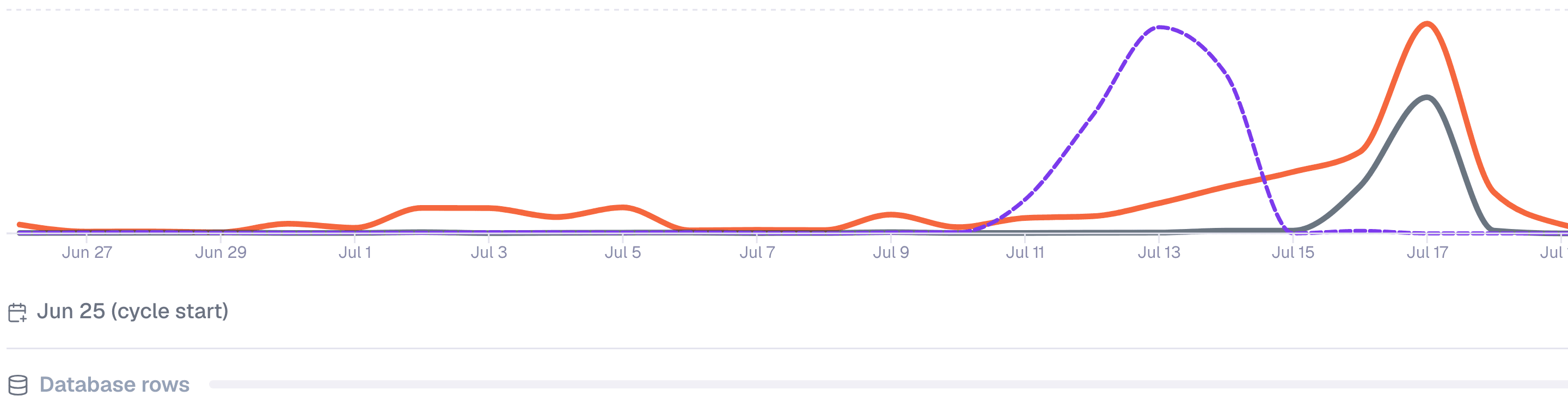
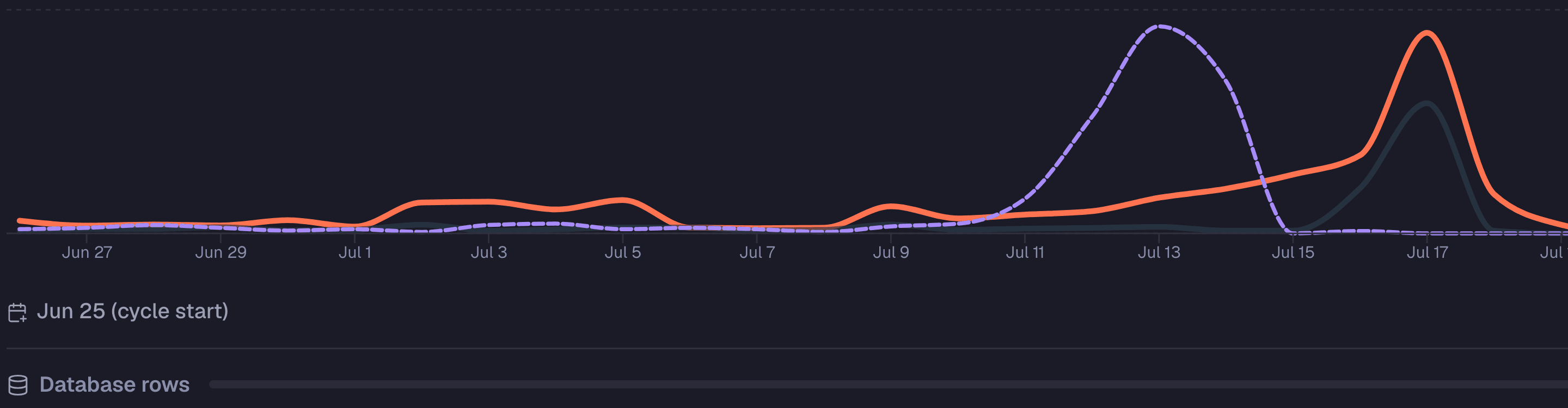
Dashboard usage chart with legend for credits and data
Credits left and reset date, not a monthly total
Credits left, average per day, active workflows, and the reset date sit in one stat strip above the chart — no separate billing page to check whether the current pace clears the cycle or runs out before it turns over.
Free-plan accounts see the identical strip and chart layout, with some values gated until you subscribe — the screen doesn't change shape when you upgrade, only what's unlocked on it.
Org admins see the same stat-strip-plus-chart component on the admin org view. It's one widget reused for the org-wide picture, not a second admin-only report to learn.


Dashboard stats row for credits left and usage averages